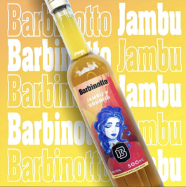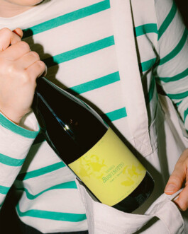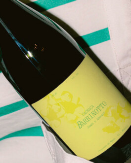
Unrequited rebranding. Hover here to see the before.
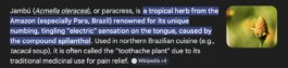
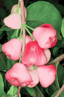
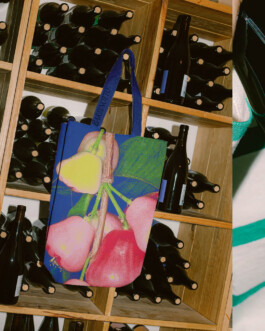
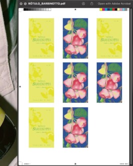
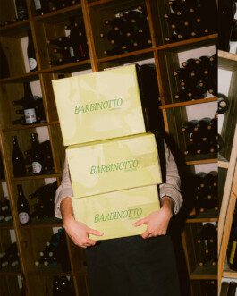
The product, cachaça of Jambú, is so elegant. There is a titillating feeling in your tongue when the liquid sits in the mouth for a minute; the taste is light and refined. A dazzling party trick from nature. While the current branding uses a heavy black typography and references Brazilian culture when imagery is used, I felt like it needed to incorporate more elements of the product itself and immediately evoke Brazilian culture in the visual language. So the perception of the product is easily conveyed by highlighting the "B" with a tilt, keeping the "Barbinotto/Brazil" connection, using a refined and lighter type family, and making use of the colours of the flag and the jambú fruit's silhouette in the packaging and merch. Jambú is a herb that fruits; the fruit itself has mesmerizing hues, and as it ripens, the color palette changes drastically, affording this designer a plethora of application possibilities if the brand so desires.