


For Ana's architecture studio in Florianópolis, we wanted a visual identity that mirrors how she is and works: precise, thoughtful, grounded, and fashionably elegant. The custom logo plays with verticality, echoing architectural lines while subtly referencing her name. Black and white, when used correctly and consistently, create a great base framework in which the projects themselves can shine. Ana works with her signature style but across multiple types of clients, homes, hospitals, interior, and lighting projects, etc. So we needed to solve this maleability problem with a all encompassing style. This language extends across stationery, signage, and digital touchpoints, where a minimal typographic palette and high-contrast, tactile materials reflect the studio's sophistication. Every element was designed to feel as if considered and effortless, much like the spaces Ana creates.
2022/Visual Identity/Brand Ecosystem
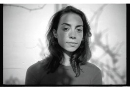
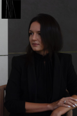
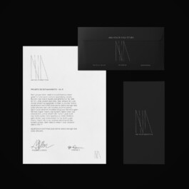
Identity systems, visual storytelling, and cultural-aesthetic research are currently my areas of interest. Viewing the design process not only as a service, but as a form of creation through empathy and discovery. My job is to bridge the mundane with the aesthetic and help translate information that can at first only be felt into information that can be seen, interacted with, and understood.
